
I started first with doing some secondary research on my own and going over some of the popular transit apps on the app stores and trying to find out what stood out and what didn't. Google Maps was something that I have used personally a lot of times however it was time to put on my UX Designer hat and look a bit harder.
Two things stood out to me :
1. Even though I had my Google Account & profile associated - it wouldn't tell me some things upfront unless I navigated through a few options. This wasn't something I wanted to do each time
2. There were some features that I rarely used - they did not make any difference in the way I used the app
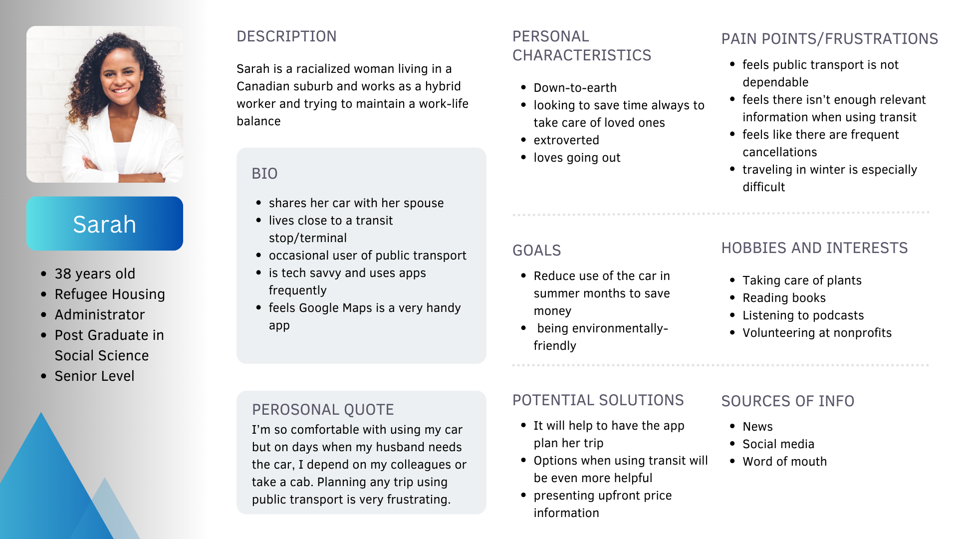
I started the next part of the project which was the User Research and identified some potential users of transit. People who either were regular users, occasional users or someone with special needs. It turned out that there was one common theme that tied all of the users and that was -"Using transit is frustrating!"
It is/was very hard for users to plan a trip using public transit as most people have different needs and feel frustrated by the lack of information about the travel when it comes to things like train schedules, delays or facilities like restrooms, heating, ramps for differently abled people etc.
Besides this however there are two major issues with using transit :
1. Lack of information
2. Systemic/Infrastructure
Many answers to the questions went into discussing the overall infrastructure related issues - which were insightful but not something that I could offer any solutions for. My focus then was to bring in as much relevant/timely information into personas for the different perspectives given by the interviewees .
I created two user personas to represent users with different backgrounds and the problems they have encountered with transit. This part turned out to be more fun than expected as it required to put my story teller hat on!
.png)
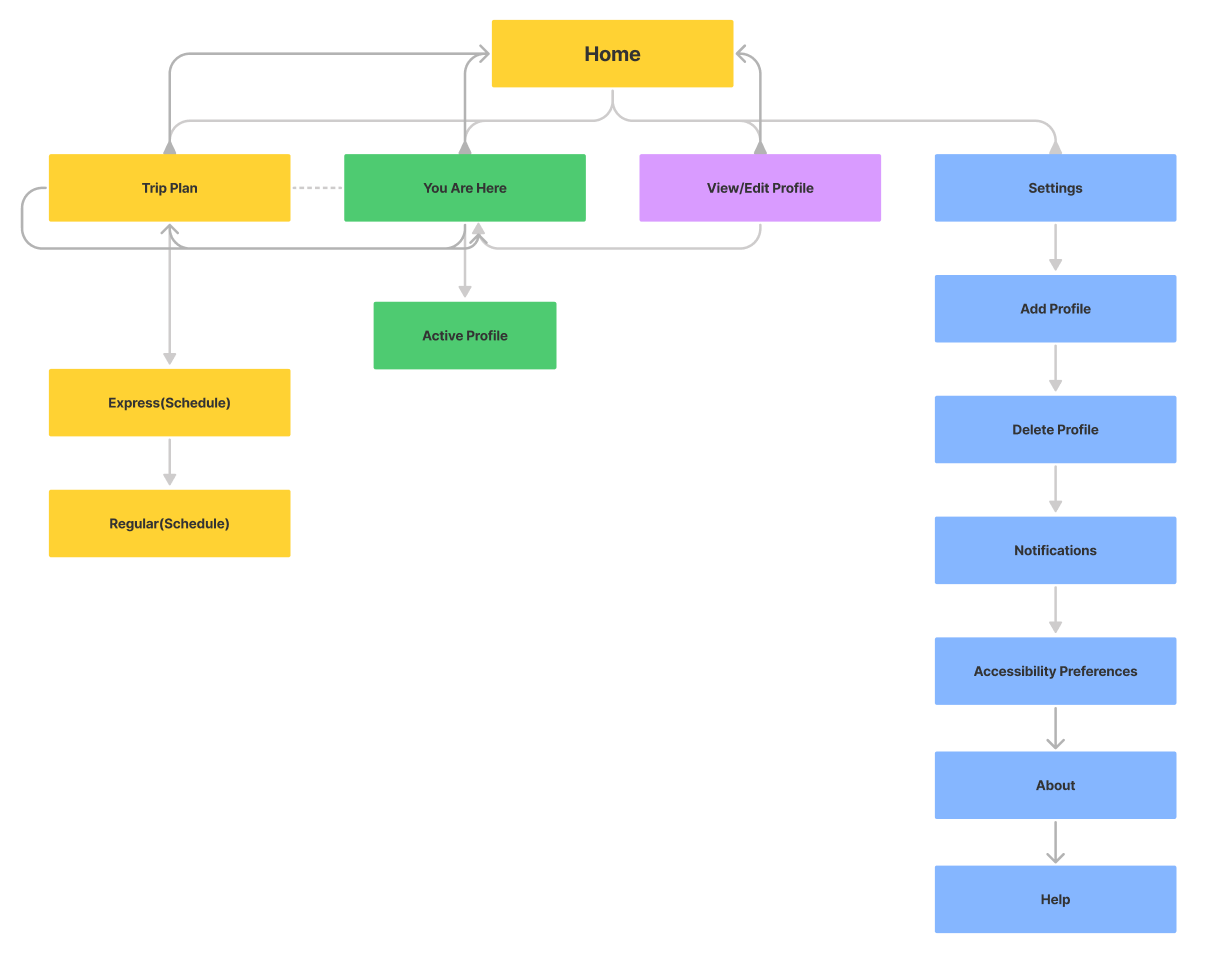
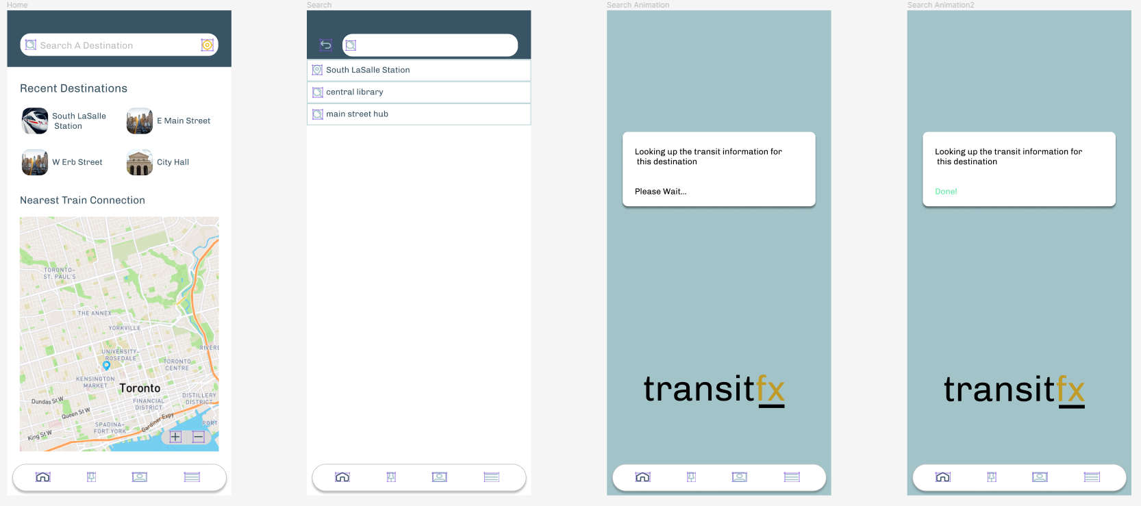
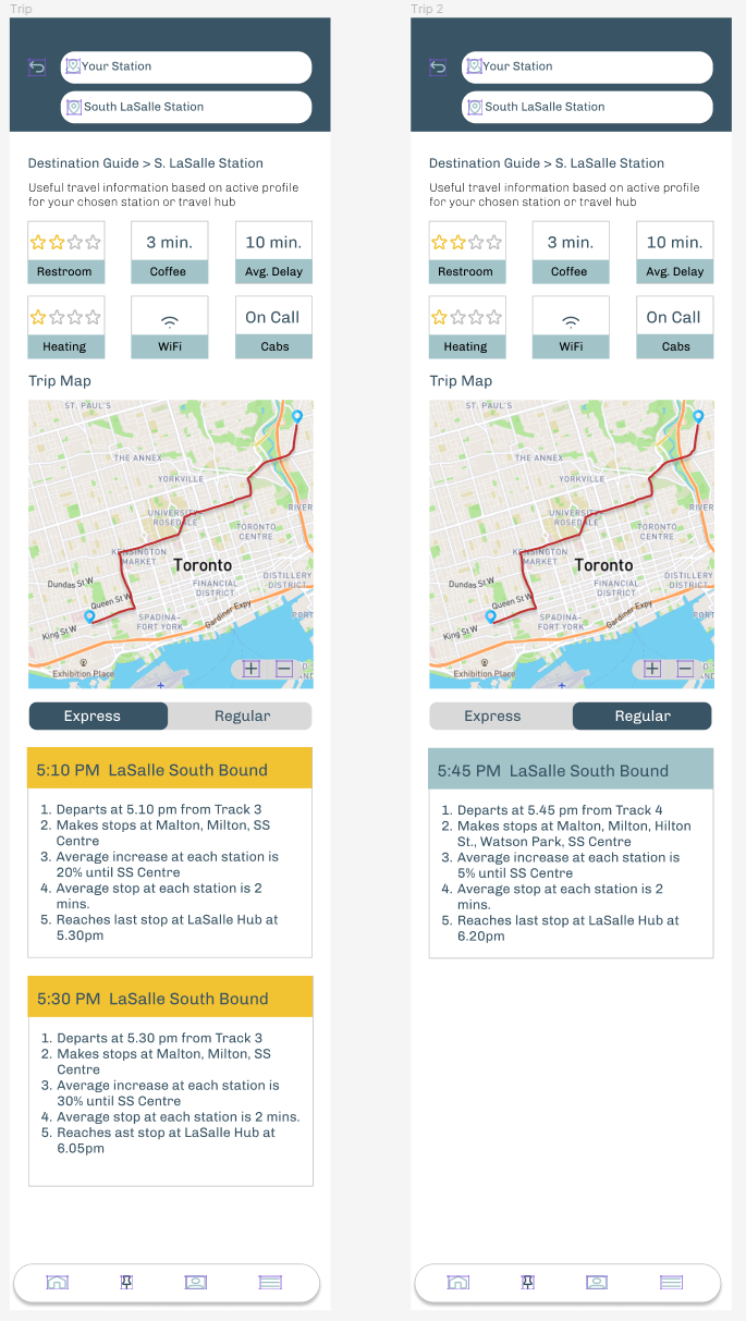
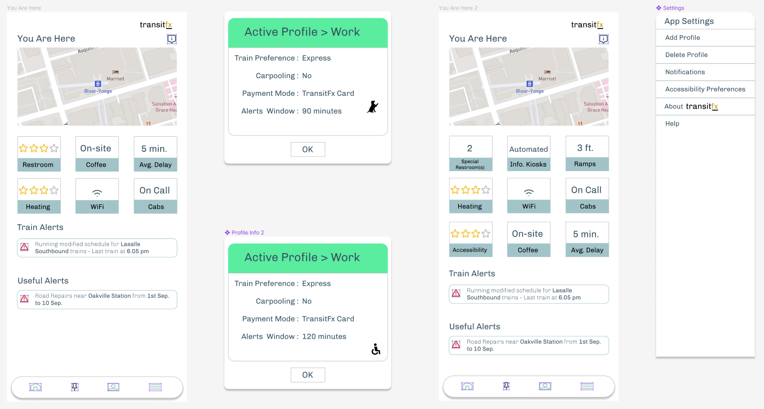
I realized that the information that needed to be presented for this app would not not contain a lot of text or forms however the structuring of the information and the context it provides the user when planning to use transit or while commuting would be the key.
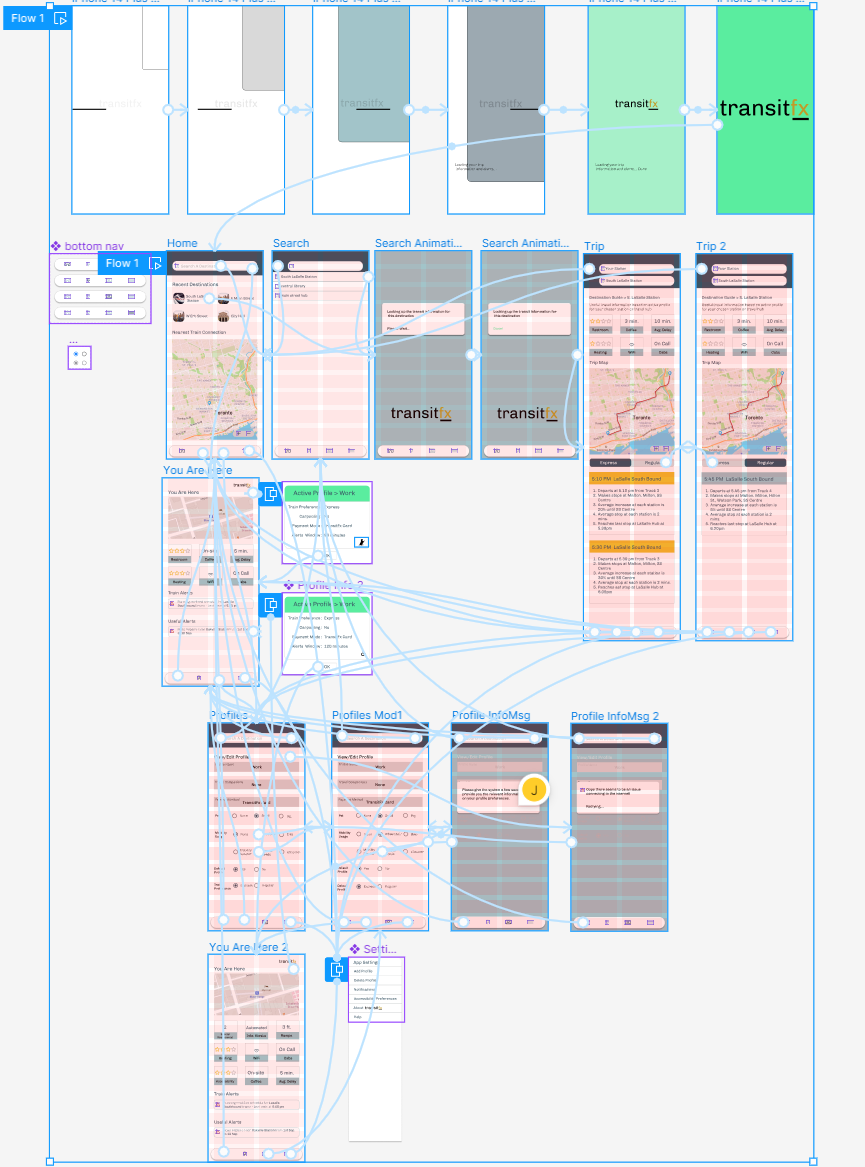
That resulted in creating a minimal yet functional interface where navigating from one screen to the other was possible using a universal menu bar at the bottom.
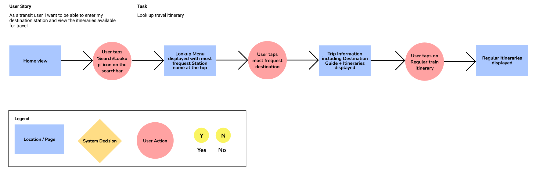
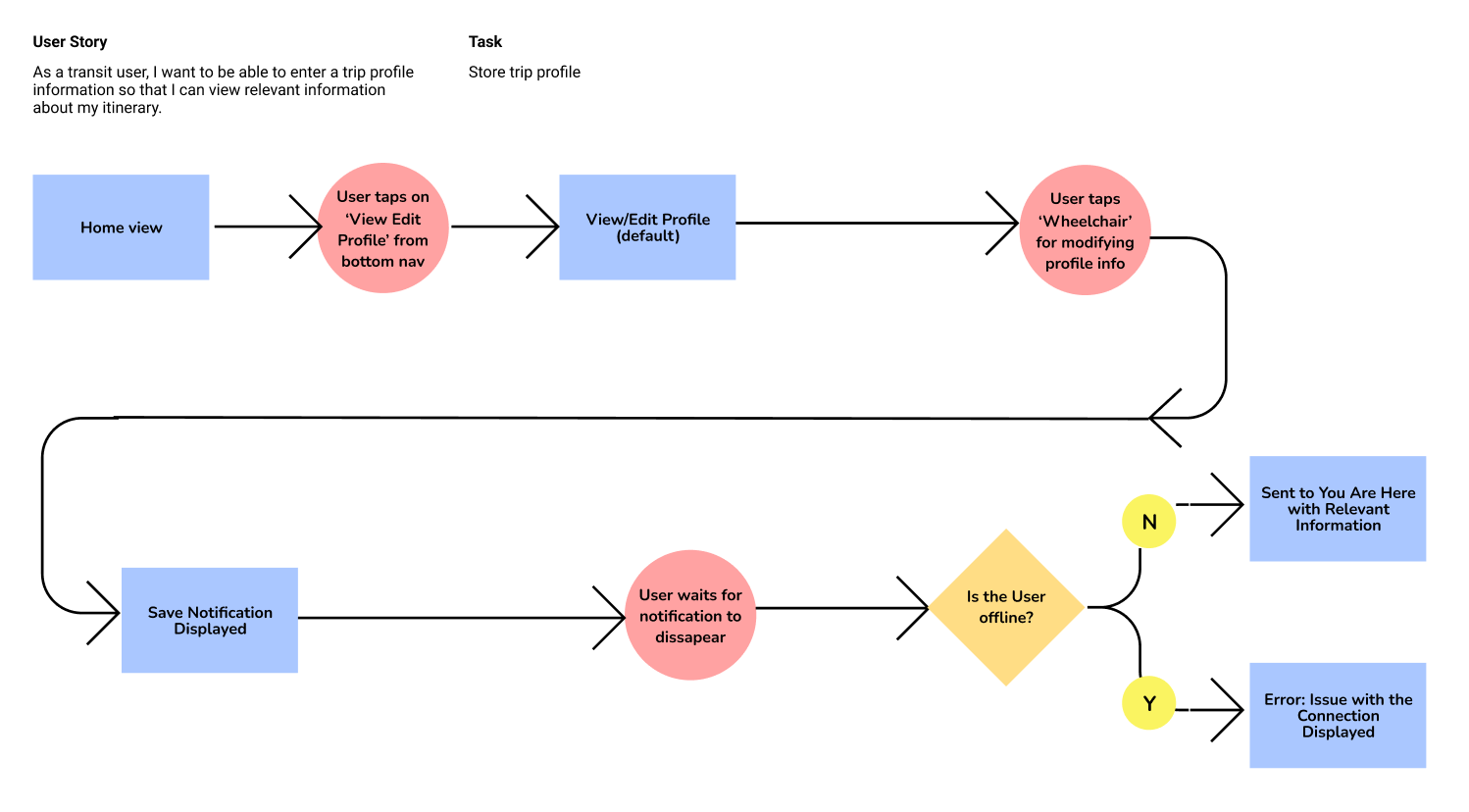
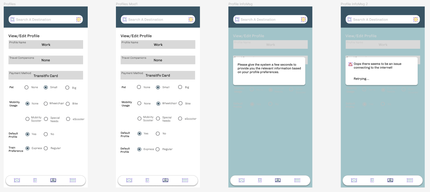
I created two simple user flows for looking up a destination that the user travels frequently too and another one where the user changes the default travel profile preference for mobility
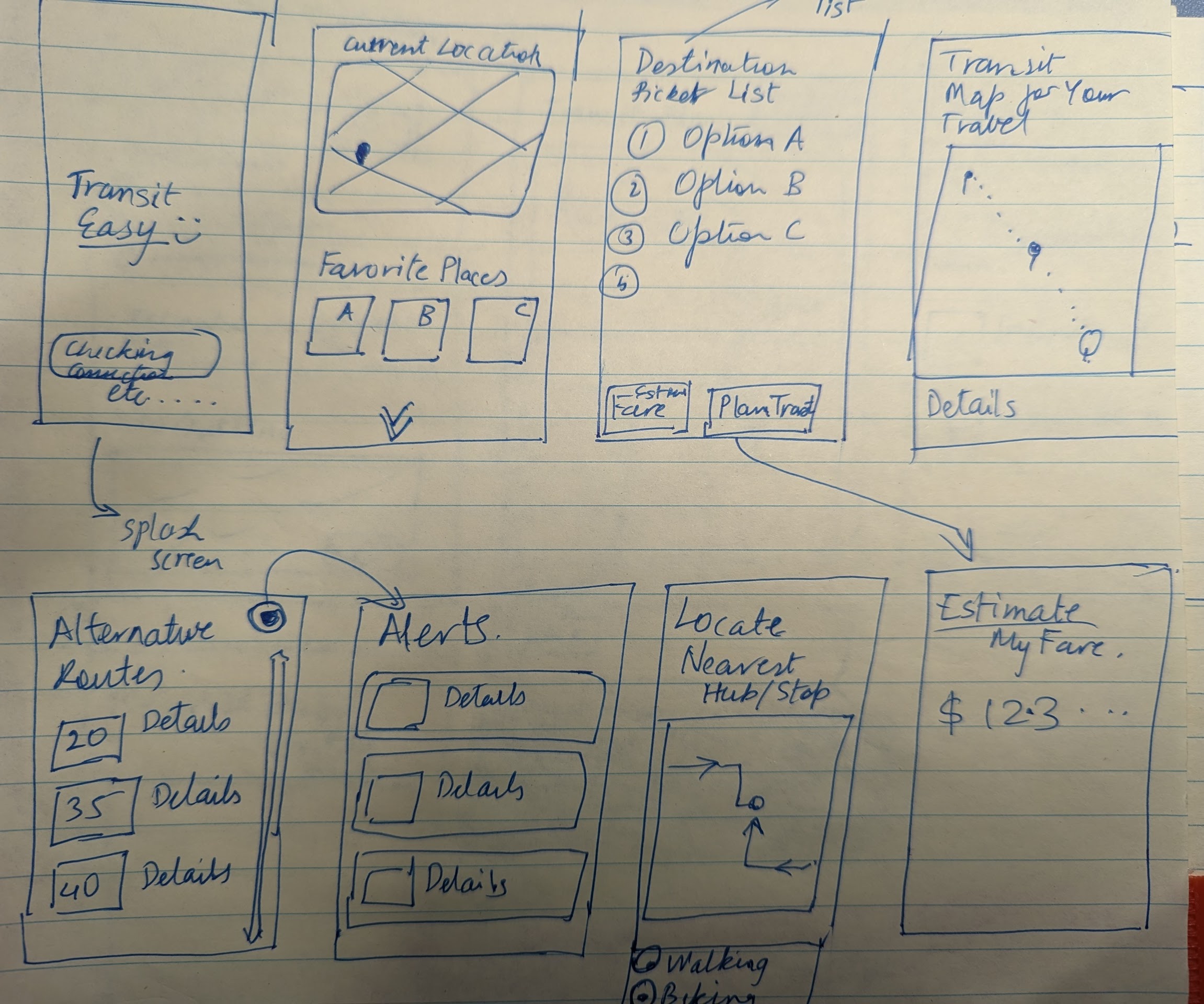
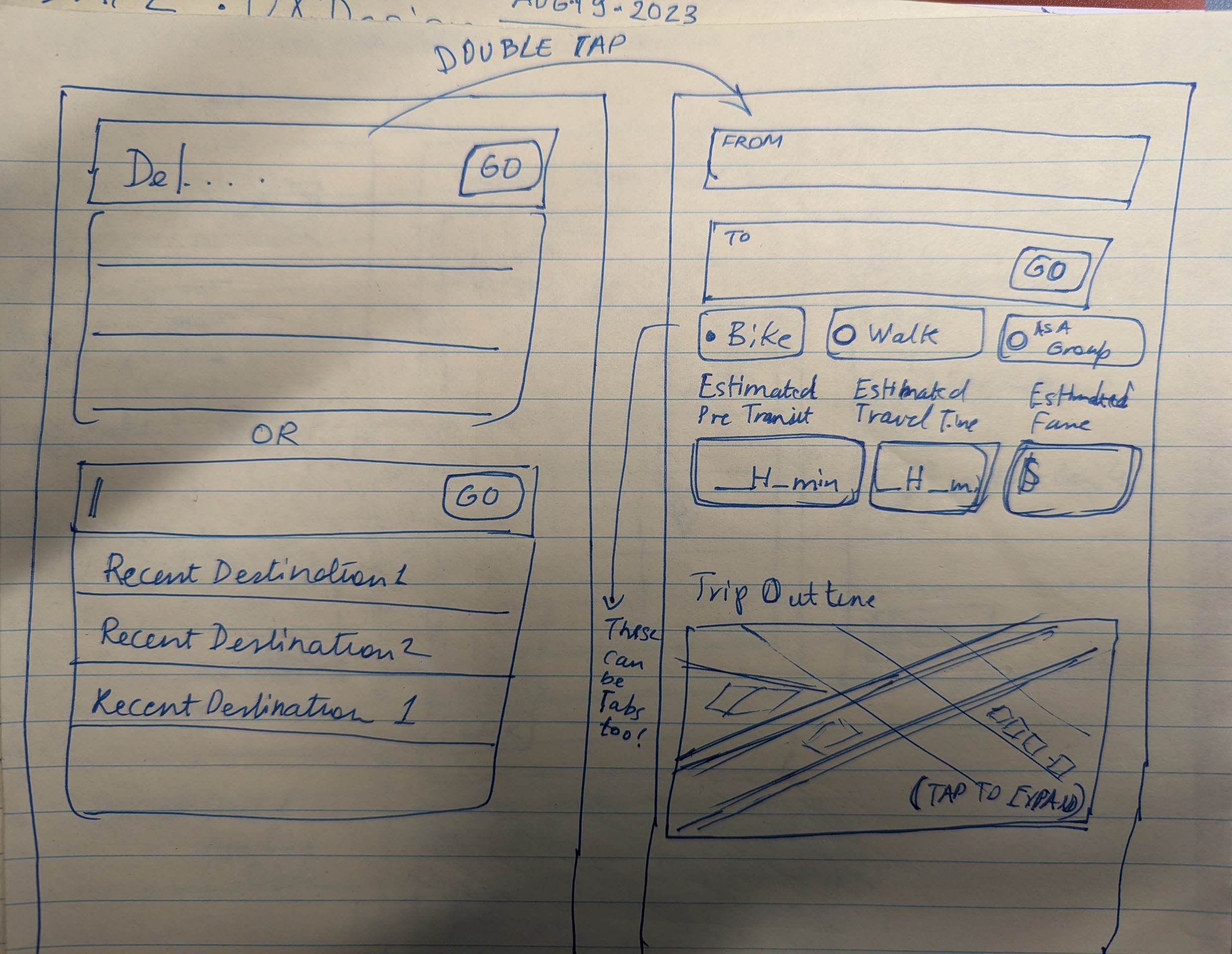
Lo-Fi Wireframing
This was where the creative process began for me, to actually coming up with a low-fidelity design in Figma before actually moving to the high-fidelity design.
As I began doing this I realized that there were refinements I was making on the fly (from what I had initially scratched out on paper).
I concentrated on the two important features in my app i.e. User Profile and Looking up a Destination.
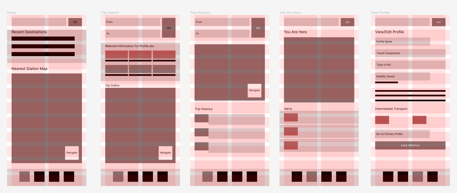
As soon as I created the lo-fi wireframes the prototype or Hi-fidelity wireframe was something I started working on soon after. It took a few iterations and a lot of coffee to build it out however I was happy that the initial sketches and lo-fi designs helped a lot in this process.
There were a few advanced things in Figma that I ended up learning outside my class hours (i.e. embedding an interactive map, start animation creation & clickable interactions with components ) which I thought I needed to enhance the interactions in the app, however in the end that paid of.
I had the opportunity for usability testing with my peers as well as the interviewers as testers and I received valuable feedback. Most testers appreciated it for the simplicity and practicality in my design.
One user found "both my strategy deck and prototype to be highly engaging". It was also plauded for the comprehensive facility reviews for various locations and "particularly beneficial for the disabled demographic in their travel planning."
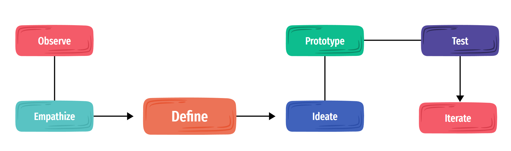
I gained a lot from the process and learned that going through the complete process of UX Design helps one gain a lot of insight into the problem at hand. It is a necessary component for developing empathy - which is what drives the design forward, in my humble opinion.
After that doing the iterations in design helps one narrow down on the MVP (minimum viable product) and also strategize further into what can be built.
In planning the next steps for this app, I would put a product roadmap in place and make sure that the features and design in the app are planned out. I would also widen the scope of user research by opening it up to more diverse set of users like people with language limitations, pregnant women etc. Lastly I would build on this idea to support transit for buses, LRT etc.
If you like what you see and want to work together, get in touch!
javshak@gmail.com